Best Y2K Wallpapers for iPhone in 2026
Five Y2K wallpapers for iPhone, from a nostalgic classic look to live motion, AI one-of-ones, and deep-black OLED picks composed around the clock.
Y2K is the loudest aesthetic in this lineup, and that’s the whole point. Born from late-90s and early-2000s design — frosted gadgets, chrome type, butterflies, sparkles, flip phones, MSN-era graphics — it’s bold, glossy, and a little chaotic. Translating that energy onto an iPhone lock screen takes some thought, because Y2K loves to fill every inch of the frame while iOS needs room for the clock and widgets. Here’s how to get the look without the clutter.
What makes a wallpaper read as Y2K
The Y2K aesthetic is built from a recognizable kit of visual motifs:
- Chrome and liquid metal — reflective silver type, melted-metal blobs, Y2K “tech” gloss.
- Butterflies, stars, and sparkles — scattered glittery accents, often with a glow.
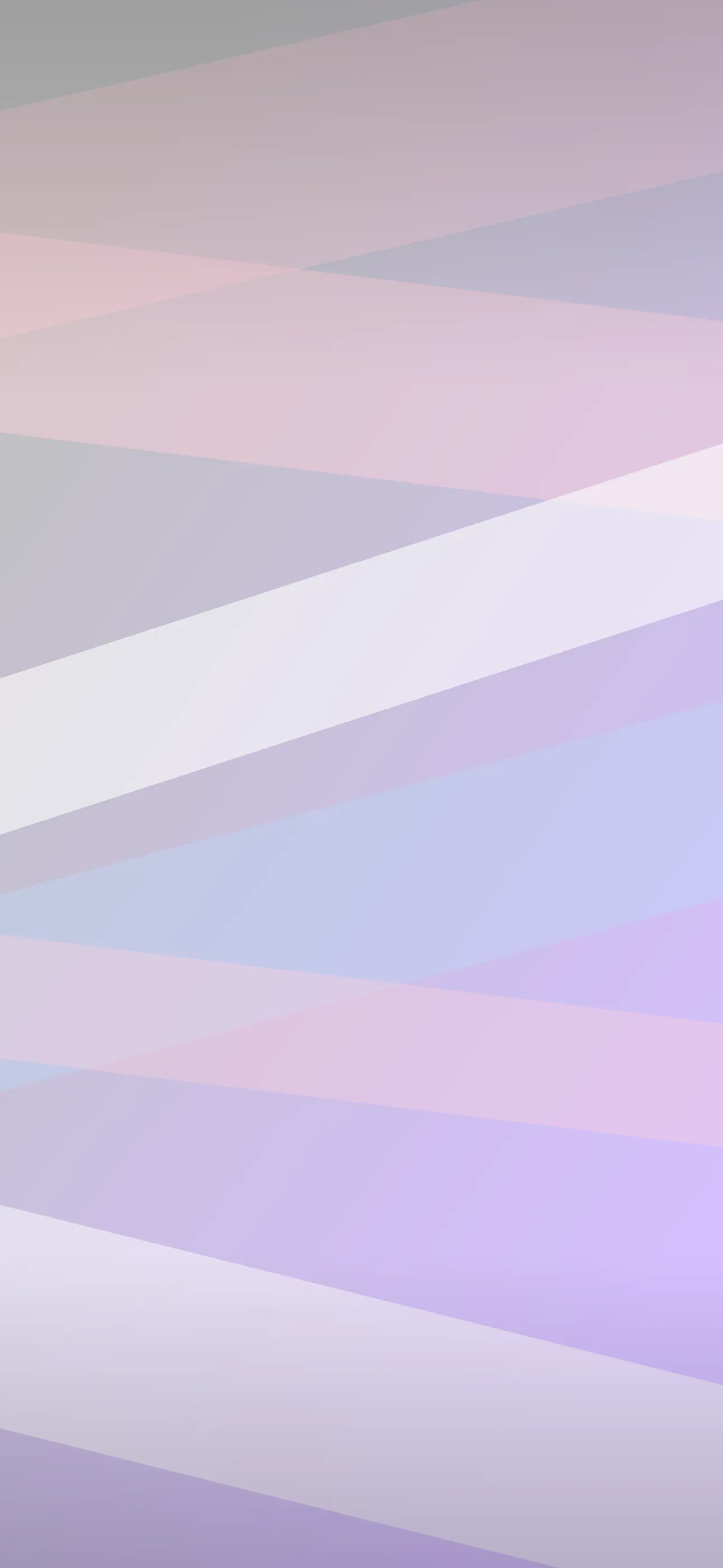
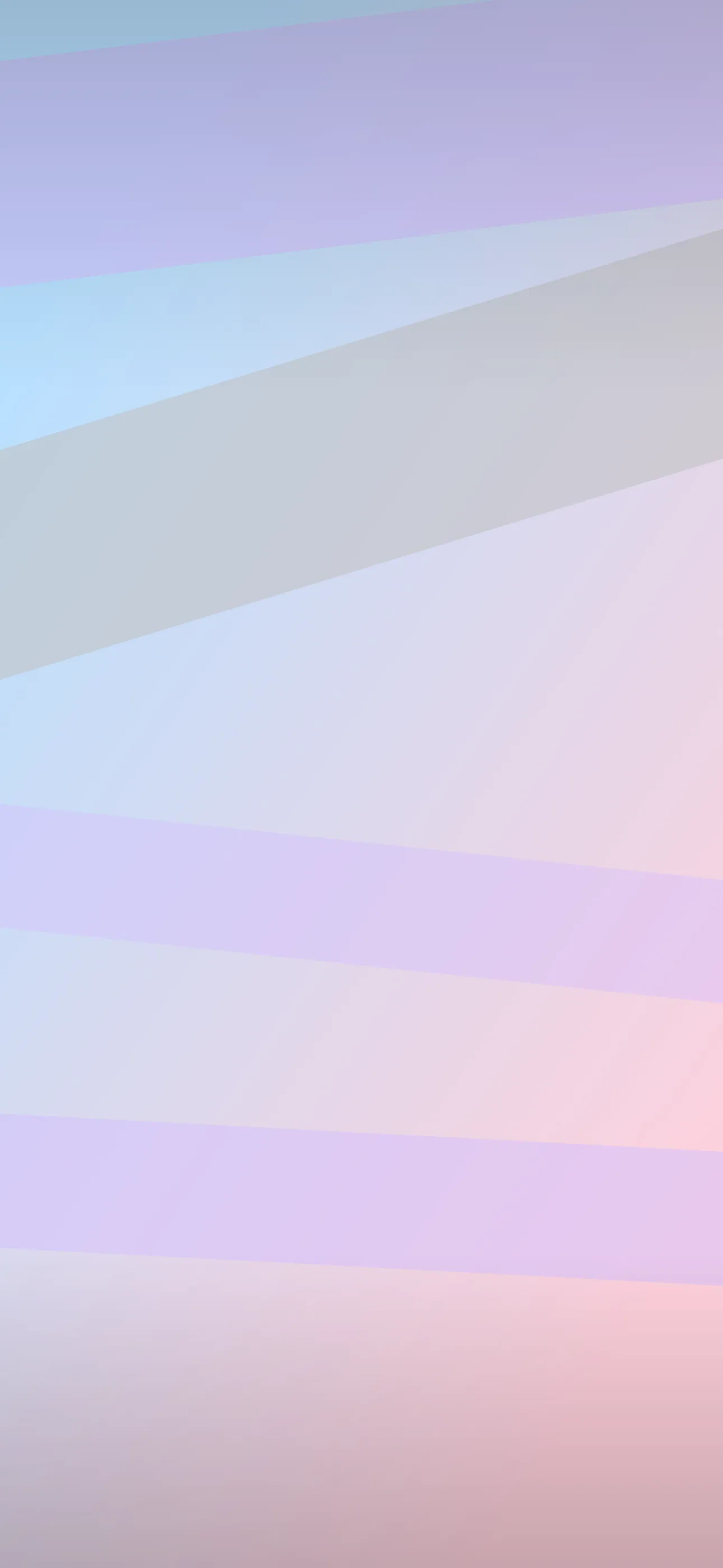
- Hyper-saturated gradients — hot pink, cyber blue, lime, purple, frequently iridescent.
- Frutiger Aero — the glossy bubbles, water droplets, and clean-tech optimism of the era.
- Cyber and grunge — pixelated graphics, scan lines, early-web textures.
You don’t need all of these at once. Pick a lane — say, chrome-and-pink glam or glossy aqua Frutiger Aero — and your lock screen will read as intentional rather than busy.
Taming the chaos around the clock
This is the core challenge. Y2K compositions are dense, but the clock sits in the upper-middle and the Dynamic Island cuts into the top. If a chrome butterfly or a glittery logo lands right behind the time, it becomes unreadable.
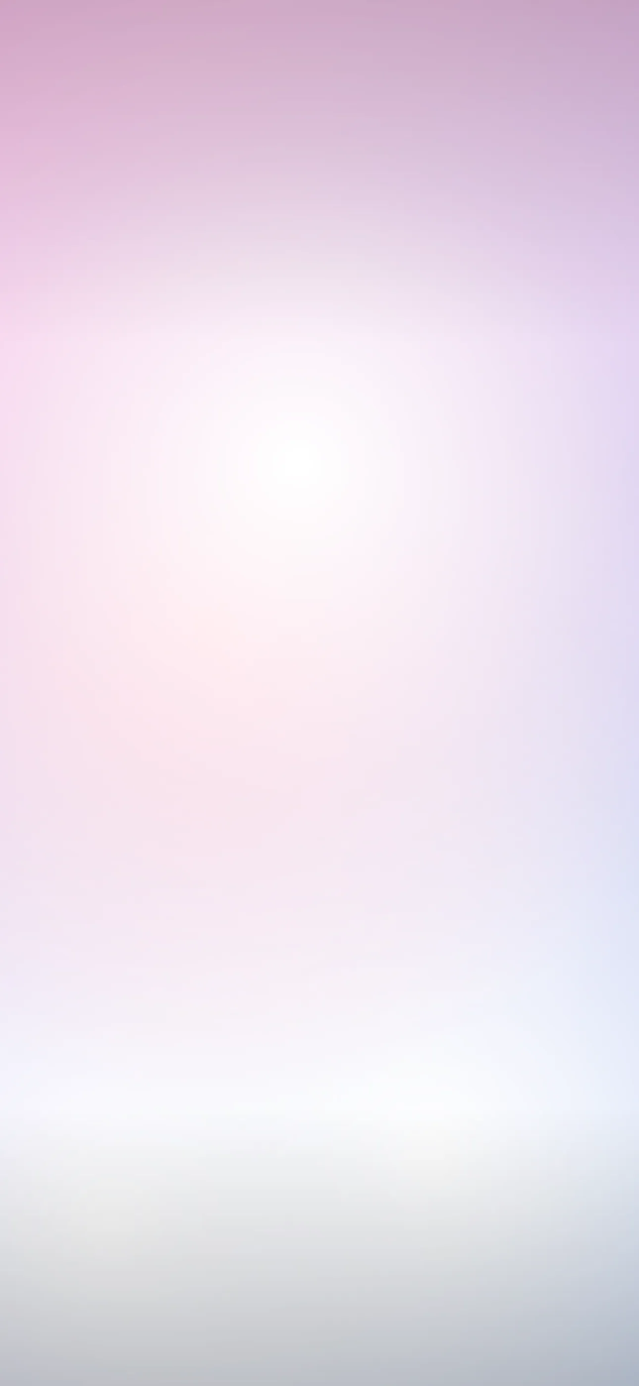
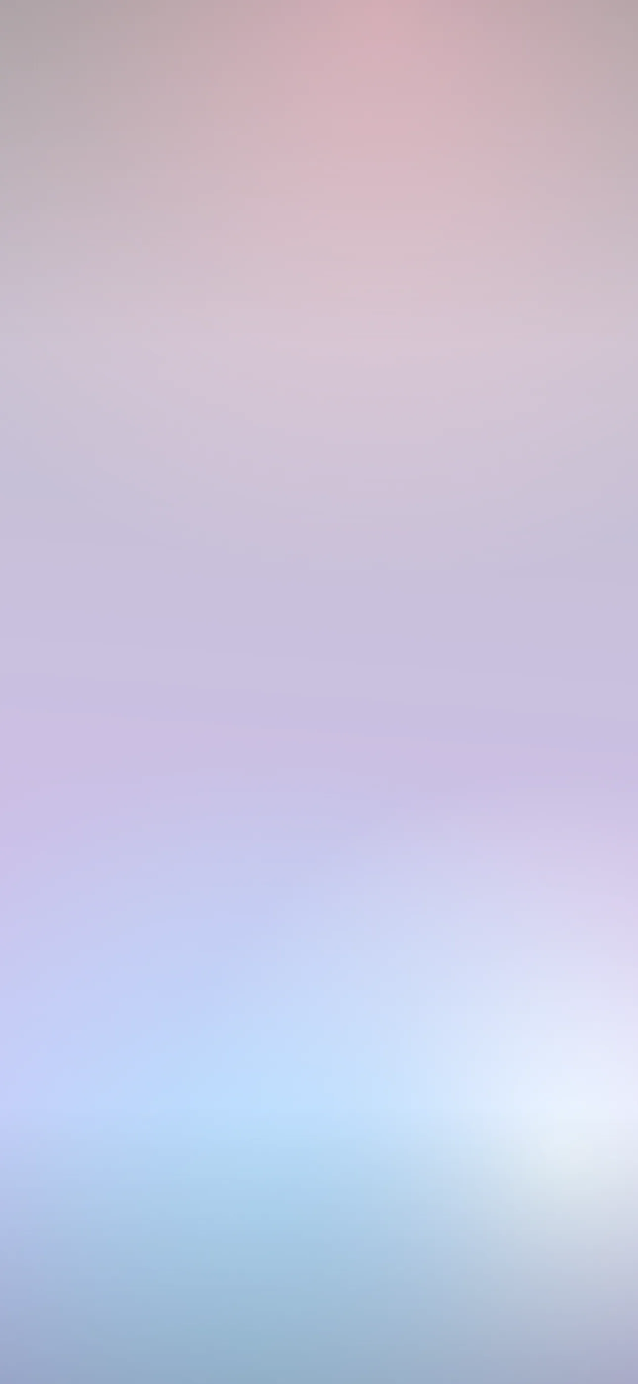
The move is to find or build a composition with a calmer pocket in the clock zone — a smoother gradient, a darker patch, or open space up top — while the busy chrome, sparkles, and motifs live in the lower half among the widgets. Iridescent gradients are great for this: they can stay relatively smooth where the clock sits and explode with color toward the bottom. At 1290x2796 on the current Pro Max, the fine sparkle and chrome detail look sharp at native resolution, but Y2K graphics saved small and upscaled turn muddy fast — and muddy chrome kills the whole effect.
Palettes and contrast
Y2K palettes are high-saturation and high-contrast by nature, which is fun but can fight white clock text:
- Hot pink + cyber blue + purple — the signature Y2K combo; make sure the clock zone isn’t pure neon.
- Chrome silver on black — sleek and very legible, also great on OLED.
- Iridescent / holographic — shifting rainbow sheen; gorgeous but keep it calmer behind the time.
- Lime and aqua Frutiger Aero — glossy and bright; pairs with clean widgets.
Y2K on OLED
The chrome-on-black side of Y2K is perfect for OLED screens. On iPhone 14 Pro and later (and recent base models), pure-black pixels switch off, so silver chrome type or a glowing butterfly against true black looks like it’s floating, with maximum contrast and a sliver of battery saved. If you love the look but want it efficient, go dark-background Y2K rather than full-neon.
Depth Effect with Y2K motifs
Y2K has some great Depth Effect subjects: a single bold motif — a chrome butterfly, a star, a flip phone, a logo — with a clear edge can be isolated by iOS so the clock layers behind it. Busy all-over collages of sparkles and gradients usually won’t trigger it, since there’s no single subject to lift. So if you want that 3D layering, build around one hero element in the lower-to-middle frame. The What is the Depth Effect on iPhone? guide explains what qualifies.
Live motion fits the era perfectly
If any aesthetic was made for motion, it’s Y2K — shimmering chrome, twinkling stars, drifting holographic gradients, glossy bubbles all suit the era’s hyper-digital energy. A live wallpaper plays when you touch and hold the lock screen, and here a bit more sparkle is on-brand, though you still want the clock zone to stay readable when it animates.
Building a Y2K set with Wallpaper Hub
Authentic Y2K graphics are scattered and often low-res across the web. A curated library skips the muddy upscales. In Wallpaper Hub the y2k collection is framed for iPhone screens, with live versions and tools to make your own:
- Use the AI generator for a one-of-one — try “chrome butterfly, holographic pink and blue gradient, sparkles, smooth dark area at top” or “Frutiger Aero glossy bubbles, aqua and lime, water droplets.”
- Open the editor to calm the clock zone, recolor a gradient, or place a single chrome motif below the time.
- Keep a glam neon version and a sleek chrome-on-black version for different moods.
Y2K borders the abstract look, so that collection is worth a browse too, alongside the full range under styles. For setup help, see How to Set an Aesthetic Wallpaper.
Quick checklist
- A calmer pocket in the clock zone so the time stays readable
- Busy chrome and sparkles kept to the lower half
- Chrome-on-true-black for the OLED look and battery edge
- One hero motif if you want Depth Effect
- Native resolution so chrome and sparkle stay crisp, not muddy
Y2K wallpapers in the app
All y2k