Best Pastel Wallpapers for iPhone
Five pastel wallpapers for iPhone, from a soft classic palette to gentle live motion, AI originals, and Depth Effect picks that complement widgets.
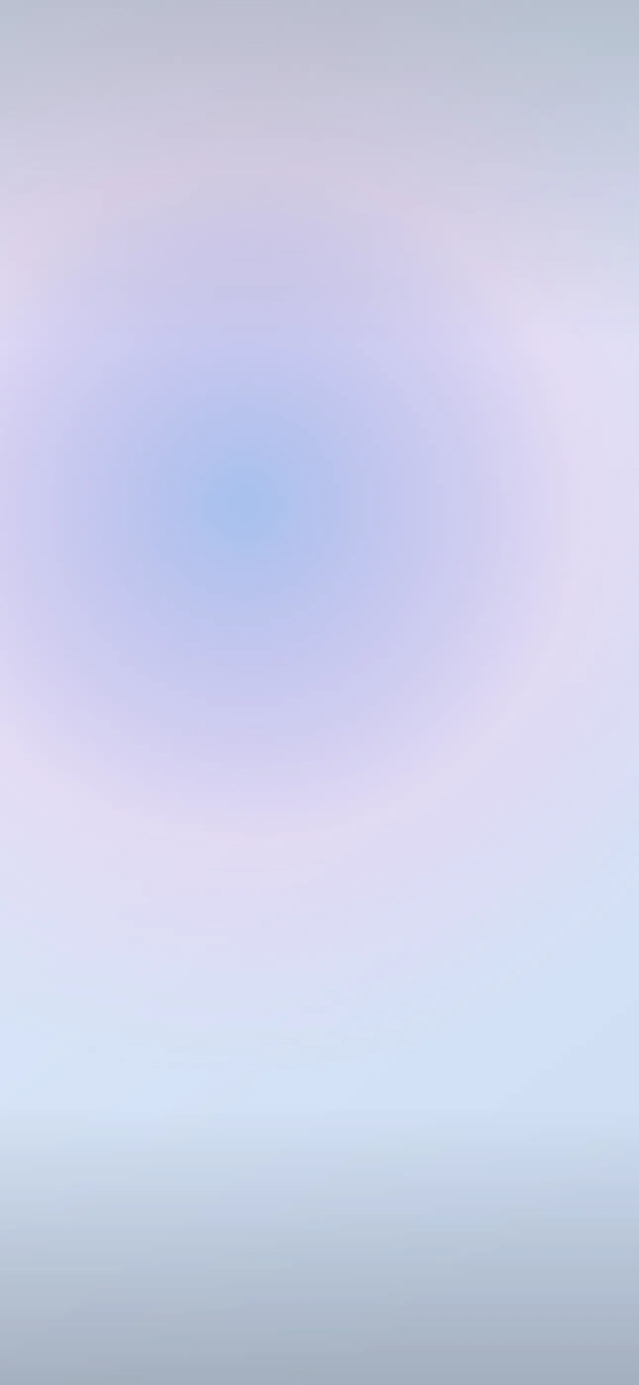
Pastels are deceptively tricky. The soft, washed-out colors that make them so pleasant — baby pink, lavender, mint, butter yellow — also have low contrast, which means a careless pastel wallpaper can swallow your clock and turn widgets into a blur. Done right, though, a pastel lock screen is genuinely lovely: gentle, cohesive, and easy to look at all day. This guide covers how to choose pastels that stay legible and how to build a coordinated set.
What “pastel” actually means here
Pastel is defined less by the hue than by the treatment: high lightness, low saturation. Any color can be a pastel if it’s softened toward white. The popular pastel directions on a phone tend to be:
- Single soft wash — one pastel tone filling the frame, calm and minimal.
- Pastel gradient — two or three soft colors blending (pink-to-lavender, mint-to-blue).
- Pastel sky — real dawn or dusk skies, which are naturally pastel.
- Cute / kawaii — soft illustrations, clouds, hearts, stars on a pastel ground.
- Pastel abstract — gentle blobs, waves, or grain, overlapping with the abstract look.
A coordinated set might be one soft wash for daily use and one playful illustrated version for a lighter mood.
The legibility problem (and the fix)
This is the one thing that makes or breaks a pastel wallpaper. iOS auto-adjusts the clock color for contrast, but if your wallpaper is uniformly pale, even white or dark text can struggle to stand out. The fixes:
- Choose pastels with a slightly deeper tone in the clock zone (upper-middle), even if the rest stays light. A gradient that’s a touch richer at the top helps a lot.
- Avoid pure near-white wallpapers if you keep a lot of widgets — light grey text on a near-white field disappears.
- Test it: set the wallpaper, then check the clock and your widget row in both bright sunlight and a dark room.
At 1290x2796 on the current Pro Max, soft gradients can band (show visible color steps) if the source is low quality, so use a clean, full-resolution image rather than an upscaled thumbnail.
Pairing pastels with widgets
Pastels look best when your widgets match the energy. iOS offers tinted and clear widget styles in recent versions — a tinted widget picking up a soft complementary color (mint widgets on a pink wash, for instance) keeps everything coordinated. Busy, full-color app widgets tend to clash with a pastel ground, so a cleaner home screen suits this aesthetic.
Pastel and OLED
Pastels are the opposite of the true-black OLED trick — they’re bright, all-on pixels — so don’t expect battery savings here. That’s fine; pastel is about feel, not efficiency. If you do want a darker companion piece, a “dusty” pastel (a pastel mixed with grey, like muted rose or sage) reads softer at night without going fully bright. Every iPhone 14 Pro and later uses OLED, so deep tones still render with clean, even color.
Where Depth Effect fits
A flat pastel wash or gradient won’t trigger Depth Effect — there’s no subject to isolate. But a pastel scene with one clear element (a single cloud, a balloon, a flower, a small character) in the lower frame can layer behind the clock. If you want that 3D look, pick an illustrated or photographic pastel with a defined foreground object rather than an all-over gradient. The What is the Depth Effect on iPhone? guide covers what qualifies.
Gentle live motion
Pastel motion should be barely-there: a slow color drift, softly floating clouds, a gentle shimmer. A live wallpaper plays when you touch and hold the lock screen, and with such soft colors a slow loop feels dreamy where fast motion feels jarring.
Building a pastel set with Wallpaper Hub
In Wallpaper Hub you can browse pastel washes, gradients, and soft illustrations already framed for iPhone, plus live versions and tools to make your own:
- Use the AI generator for a custom palette — try “soft pink-to-lavender gradient, slightly deeper at top, smooth, no banding” or “pastel sky with one small cloud, mint and peach, dreamy.”
- Open the editor to deepen the clock zone or recolor a wash to match your widgets.
- Keep one airy daytime pastel and one dusty muted version for evening.
Pastel sits close to both minimalist and abstract, so those collections are worth a look, and you can browse the full range under styles. For setup help, see How to Set an Aesthetic Wallpaper.
Quick checklist
- A slightly deeper tone in the clock zone for legibility
- Tinted or clear widgets to keep the palette coordinated
- A clear foreground element if you want Depth Effect
- A clean, full-resolution source so gradients don’t band
- Subtle, slow motion only, if you go live
Wallpapers from Wallpaper Hub
Full gallery