Best Neon Wallpapers for iPhone
A guide to neon wallpapers for iPhone, covering glowing signs, neon-on-black contrast, OLED benefits, and keeping the clock readable against the glow.
Neon is less a single theme than a quality of light — the electric glow of signs, tubes, and lasers against darkness. It overlaps with cyberpunk, vaporwave, and Y2K, but neon as a category is about one thing above all: bright, saturated color that appears to emit light from a dark background. That makes it one of the most striking looks on an iPhone, and a near-perfect match for OLED screens. The work is controlling the glow so it dazzles without burying the clock. Here’s how.
What makes a wallpaper read as neon
Neon’s whole identity is luminance and contrast:
- Glowing tubes and signs — bent-tube lettering, arrows, hearts, classic bar-sign shapes.
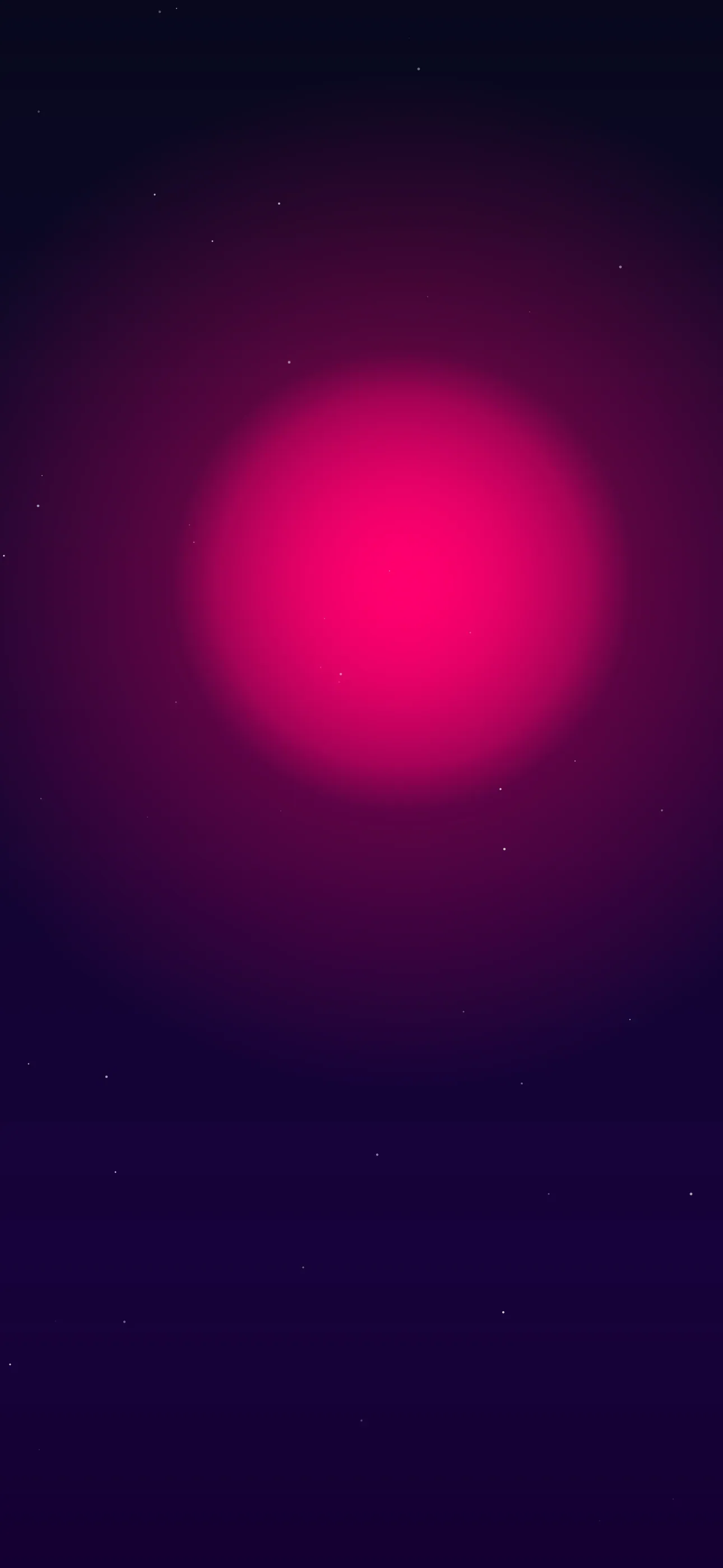
- Saturated color on black — magenta, cyan, electric green, hot orange against deep dark.
- Bloom and haze — soft glow halos around bright sources, the look of light in air.
- Lasers and light trails — beams, streaks, long-exposure motion of light.
- Reflections — neon mirrored in wet pavement or glass.
The defining rule is contrast: neon only reads as neon when it sits against darkness. A bright color on a bright background just looks like a bright color.
Composing around the clock and Dynamic Island
Neon is intense, so placement is everything. The clock sits in the upper-middle and the Dynamic Island cuts a pill into the top. A glowing sign right behind the time fights the white text directly.
The move is to keep the clock zone dark — open black, shadow, or a soft, dim glow — and let the bright tubes, signs, and trails sit in the lower half near the widgets. Because neon depends on darkness, a near-black upper area is completely on-theme. A single glowing sign rising from the lower frame, with deep black above, is a classic and very legible layout.
Palettes and widget contrast
Neon palettes are by definition high-saturation, but the background is what protects legibility:
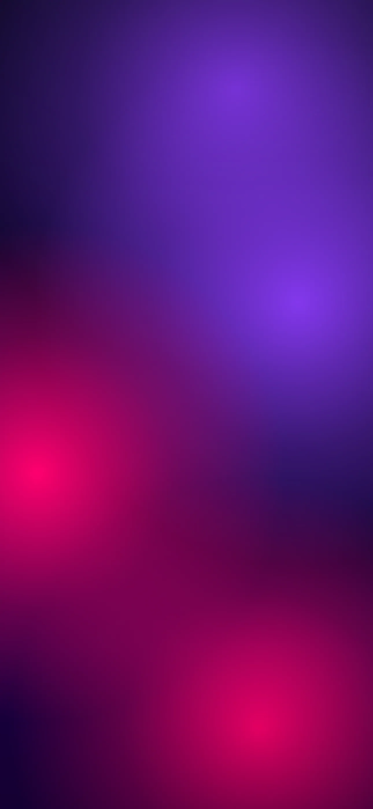
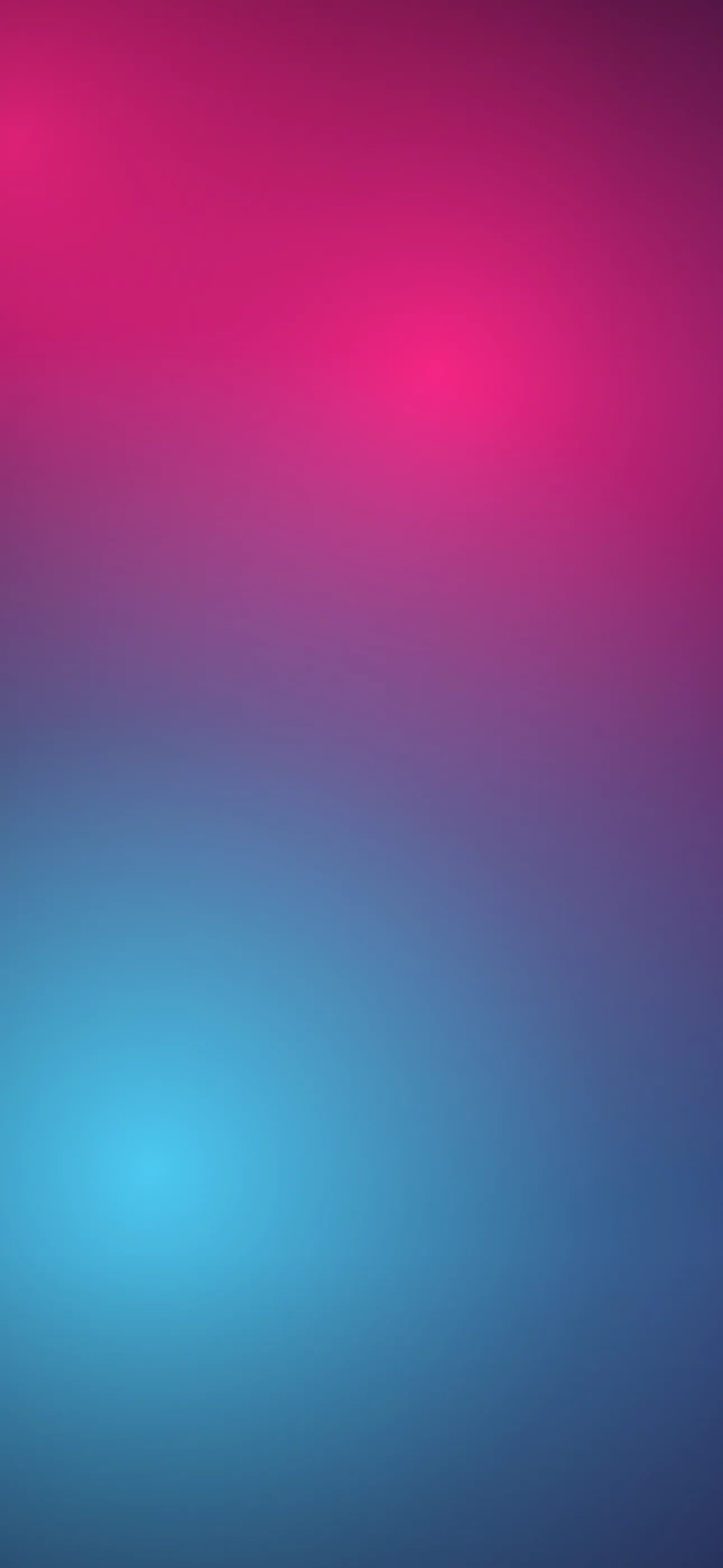
- Magenta and cyan on black — the signature; deeply legible because the dark base supports white text.
- Electric green on black — striking and clean.
- Warm neon (orange, pink) on black — softer, retro-sign feel.
- Multi-color neon — fun but keep the busiest cluster low and the clock zone dark.
Widgets sit just under the clock. Over a bright glowing sign their text washes out, so keep that band dim and the brightest elements lower.
Neon and OLED: the perfect pairing
Neon is the single best-matched aesthetic for OLED. On iPhone 14 Pro and later (and recent base models), true-black pixels switch off entirely, so a glowing magenta sign against pure black appears to genuinely emit light, with the deepest possible contrast and a real battery benefit. Choosing neon-on-true-black means you get the most dramatic version of the look and the most efficient one at the same time. The dark OLED guide covers this contrast advantage in more depth.
Depth Effect with a glowing subject
Depth Effect lets iOS lift a clear subject so the clock layers behind it. A single neon sign, heart, or glowing object with a clean edge over deep black is an excellent candidate, giving a layered 3D look where the sign sits in front of the time. Busy all-over neon scenes usually won’t trigger it because there’s no single subject to lift. Build around one hero sign in the lower-to-middle frame if you want it. See the Depth Effect explainer.
Motion makes neon flicker to life
Few looks suit motion as well as neon. A flickering sign, a pulsing tube, a sweeping laser, a drifting light trail — all of it amplifies the electric feel. A live wallpaper plays when you touch and hold the lock screen, and subtle neon animation here is genuinely impressive, as long as the clock zone stays dark and calm while it moves.
Resolution and clean glow
Neon glow is fine gradient detail, and upscaling smears it into a muddy haze with visible banding. A crisp bright tube against clean black needs a high-quality source. Aim for the native panel resolution — 1290x2796 on the current Pro Max — so the bloom stays smooth and the blacks stay clean.
How to set or generate a neon wallpaper
In Wallpaper Hub the dark and abstract collections both feature strong neon-on-black designs, framed for iPhone, with live versions and tools to make your own:
- Use the AI generator for a one-of-one — try “glowing neon sign, magenta and cyan, deep black background, dark calm area at top” or “neon laser light trails on pure black, electric green.”
- Open the editor to darken the clock zone, boost the glow, or place a single sign below the time.
- Keep a single-sign Depth Effect version and a multi-color version for variety.
For setup, see How to Set an Aesthetic Wallpaper.
FAQ
Why are neon wallpapers so good on OLED iPhones? Neon is bright color on black, and OLED switches off true-black pixels entirely. That gives the glow maximum contrast, the deepest blacks, and a small battery saving all at once.
How do I keep my clock readable against bright neon? Keep the upper-middle dark, where the clock sits, and place the glowing signs and trails in the lower half. Neon depends on darkness anyway, so a black clock zone fits the look.
Wallpapers from Wallpaper Hub
Full gallery