Best Grunge Wallpapers for iPhone
A guide to grunge wallpapers for iPhone, covering distressed textures, muted palettes, dark OLED variants, and composing gritty looks around the clock.
Grunge is the aesthetic of wear and tear made beautiful. Rooted in the early-90s Seattle music scene and the zine-and-flyer culture around it, it leans on distressed textures, faded photocopies, torn paper, scratched film, and a deliberately rough, lo-fi feel. On an iPhone that roughness can look incredible — moody and personal — but it needs a little restraint so the clock and widgets don’t disappear into the noise. Here’s how to choose and build a grunge lock screen that still works as a phone.
What gives grunge its look
Grunge isn’t one image; it’s a set of textures and attitudes layered together:
- Distressed textures — grain, scratches, dust, paper tears, and torn-edge collage.
- Photocopy and halftone — high-contrast black-and-white, Xerox dithering, smudged ink.
- Faded, washed-out color — desaturated, slightly green or sepia, like a sun-bleached poster.
- Type and stamps — typewriter fonts, scrawled handwriting, stencil text, grungy splatters.
- Soft focus and light leaks — blurred edges, film burn, analog imperfection.
Pick a direction — moody monochrome photocopy, or faded color collage — and the screen reads as intentional grunge rather than a messy overlay.
Composing around the clock and Dynamic Island
Grunge wants to fill the frame edge to edge, which fights iOS layout. The clock sits in the upper-middle and the Dynamic Island cuts a pill into the top. If a heavy splatter or a high-contrast scratch lands right behind the time, legibility goes.
The reliable approach is to keep a calmer patch behind the clock — a smoother stretch of faded paper, a darker area, or open negative space — and push the dense texture toward the lower half where the widgets live. Grunge actually has an advantage here: a faded, low-contrast background reads as on-theme, so a quiet clock zone never looks out of place.
Palettes, contrast, and widget legibility
Most grunge palettes are muted, which is friendly to white clock text, but watch the extremes:
- Faded sepia and bone — warm, vintage, easy on legibility.
- Washed greens and olives — that classic flannel-era tone; keep it dim behind widgets.
- High-contrast monochrome — photocopy black-and-white; striking, but a bright white patch behind the time can wash it out.
- Bruised purples and rust — moody and rich; pairs well with light widget text.
Lock-screen widgets sit just under the clock, so a busy halftone there can make icons hard to parse. Leave that band a touch calmer.
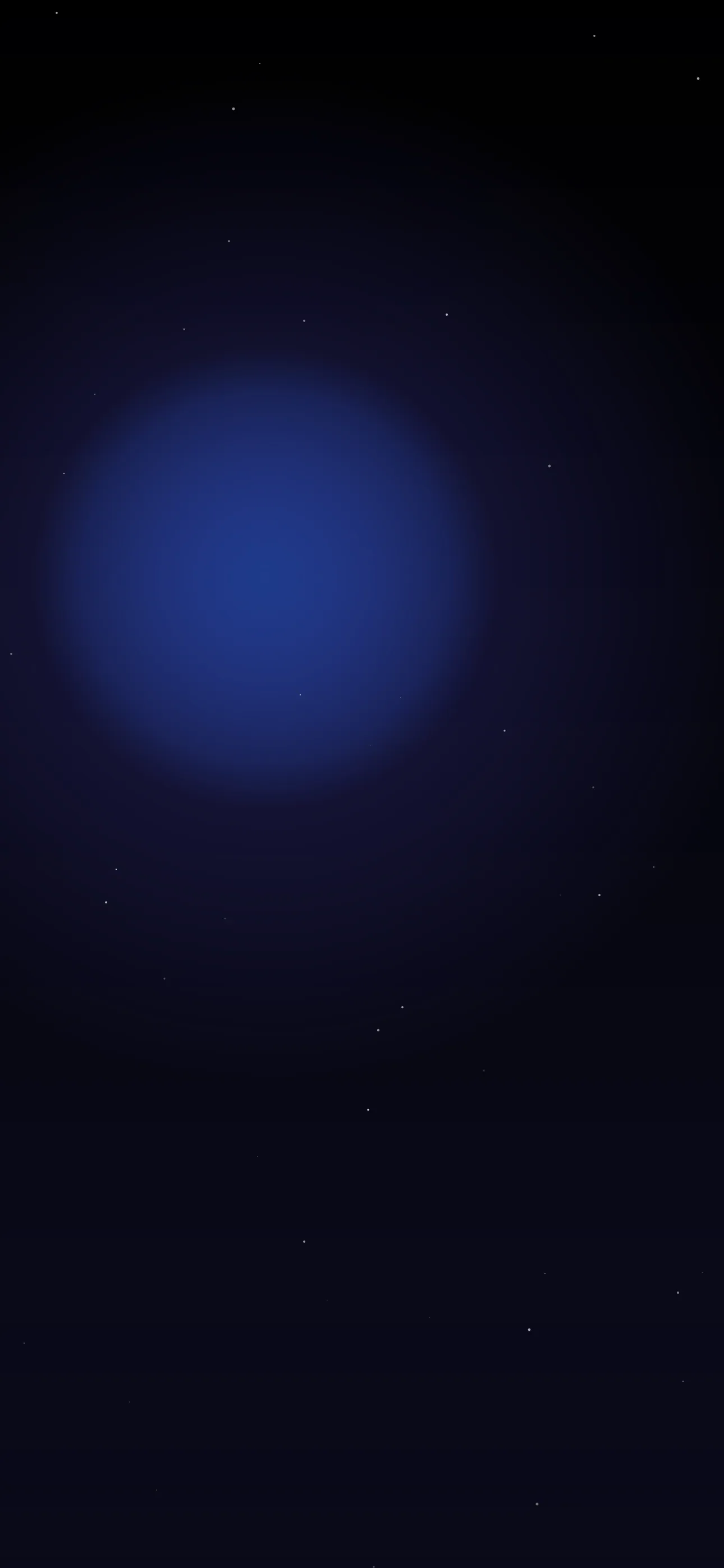
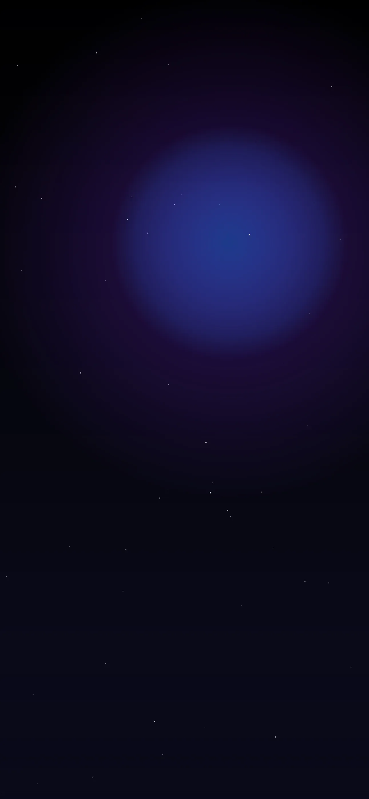
Grunge on OLED
The darker, monochrome side of grunge suits OLED screens well. On iPhone 14 Pro and later (and recent base models), true-black pixels switch off entirely, so a scratched white texture or pale type floating on near-black looks deep and contrasty, with a small battery benefit. If you love grunge but want it efficient, build on a black base rather than a bright paper background.
Depth Effect and grunge
Depth Effect lets iOS lift a clear foreground subject so the clock layers behind it. Grunge is mostly all-over texture, which usually won’t trigger it. But if you build around one defined subject — a torn photo, a cassette, a single object with a clean edge over a textured field — iOS can isolate it. Flat overlapping textures with no clear subject won’t qualify. See What is the Depth Effect on iPhone? for what counts.
Resolution matters more than usual
Grunge grain is fine detail, and that’s exactly what gets destroyed by upscaling. A texture saved small and stretched to fill the screen turns into mushy blur instead of crisp scratches. Aim for the native panel resolution — 1290x2796 on the current Pro Max — so dust, halftone dots, and torn edges stay sharp. Ironically, grunge needs clean source files to look properly dirty.
How to set or generate a grunge wallpaper
Authentic grunge sources are scattered and often low-res across the web. A curated library skips the bad upscales. In Wallpaper Hub the dark and abstract collections both touch the grunge mood, framed for iPhone screens, with tools to make your own:
- Use the AI generator for a one-of-one — try “distressed grunge collage, faded sepia paper, torn edges, typewriter text, calm area at top” or “high-contrast photocopy halftone, scratched black and white, light leak.”
- Open the editor to dim the clock zone, desaturate a color shot, or layer grain over a photo.
- Keep a faded-color version and a monochrome OLED version for different moods.
For setup help, see How to Set an Aesthetic Wallpaper.
FAQ
Will a grungy texture make my clock hard to read? Only if the busy part sits behind the time. Choose or edit a wallpaper with a calmer, lower-contrast patch in the upper-middle and you keep the gritty look without losing legibility.
Is grunge good for OLED iPhones? Yes, the dark monochrome side is ideal. Build on a true-black base so pixels switch off, which deepens contrast and saves a little battery.
Wallpapers from Wallpaper Hub
Full gallery