Best Boho Wallpapers for iPhone
A guide to boho iPhone wallpapers: the three real waves of Bohemianism behind the look today, how it differs from cottagecore and western, and how to keep it legible on a lock screen.

“Boho” is short for Bohemian, and the word has been migrating for almost two centuries before it ever landed on a phone wallpaper. Tracing that path actually explains the look’s current eclecticism — boho borrows from everywhere because, historically, it always has.
Three Waves of Bohemia
The original Bohemians were 19th-century French artists and writers — the term literally referenced Romani travelers, assumed (incorrectly) by Parisians to have come from Bohemia in central Europe — who lived outside conventional middle-class norms: poor, itinerant, and devoted to art over respectability. Puccini’s opera La Bohème and the Parisian Left Bank scene that inspired it fixed the image: garrets, secondhand clothes, a rejection of bourgeois convention.
The second wave was the 1960s–70s counterculture — hippie fashion at Woodstock, flowing silhouettes, Eastern-inspired prints, a back-to-the-land ethos that again rejected mainstream convention, this time specifically through anti-war and communal-living politics. This is where most of the literal visual motifs still in use today come from: fringe, macramé, paisley, natural fibers.
The third wave is the one that actually built the aesthetic you’re choosing a wallpaper from: 2010s “boho chic,” crystallized by Coachella festival fashion and brands like Free People, which kept the 1960s motifs (fringe, flowing fabric, natural texture) but stripped out the politics entirely, repackaging bohemianism as a purchasable look rather than a countercultural stance. What trends today is a further-softened version of that: less festival-specific, more generally “earthy and eclectic,” optimized for interior-design photography and, now, phone screens.
Boho vs. Cottagecore vs. Western: Where the Lines Actually Are
These three constantly overlap in earthy color palettes and nature motifs, which is exactly why they get confused:
- Boho is globally eclectic and warm — it mixes patterns and cultural references freely (macramé, mandala prints, desert plants, Moroccan-adjacent motifs) in the service of a relaxed, lived-in, well-traveled mood. The eclecticism itself is the point.
- Cottagecore is softer, quieter, and specifically pastoral — pressed flowers, gingham, a single cottage garden, nostalgia for a slower rural European life rather than a traveled, eclectic one. Where boho layers patterns, cottagecore tends toward one calm scene.
- Western shares boho’s earth tones and desert imagery but is culturally specific to Americana — cowboy motifs, denim, horseshoes, a particular regional identity rather than boho’s deliberately unplaceable, global mix.
If the reference image mixes a Moroccan-style arch with macramé and a desert plant, that’s boho. If it’s one quiet cottage garden scene, that’s cottagecore. If it has a cowboy hat or horseshoe, that’s western.
The Motifs That Make It Read as Boho
- Earthy palette — terracotta, rust, ochre, sand, cream, muted sage; always warm, never crisp or cool.
- Natural textures — woven rattan, jute, linen, raw clay and plaster; materials that look handmade rather than manufactured.
- Signature shapes — arch doorways, pampas grass, macramé, sun-and-moon motifs, desert plants; the most recognizable single-glance boho signals.
- Sun-faded warmth — nothing crisp or saturated; everything looks gently bleached by light, a direct visual echo of the “worn-in, well-traveled” mood the aesthetic has carried since the 1960s.
- Deliberate imperfection — slightly uneven lines, organic shapes, handwoven-looking patterns rather than precise geometry.
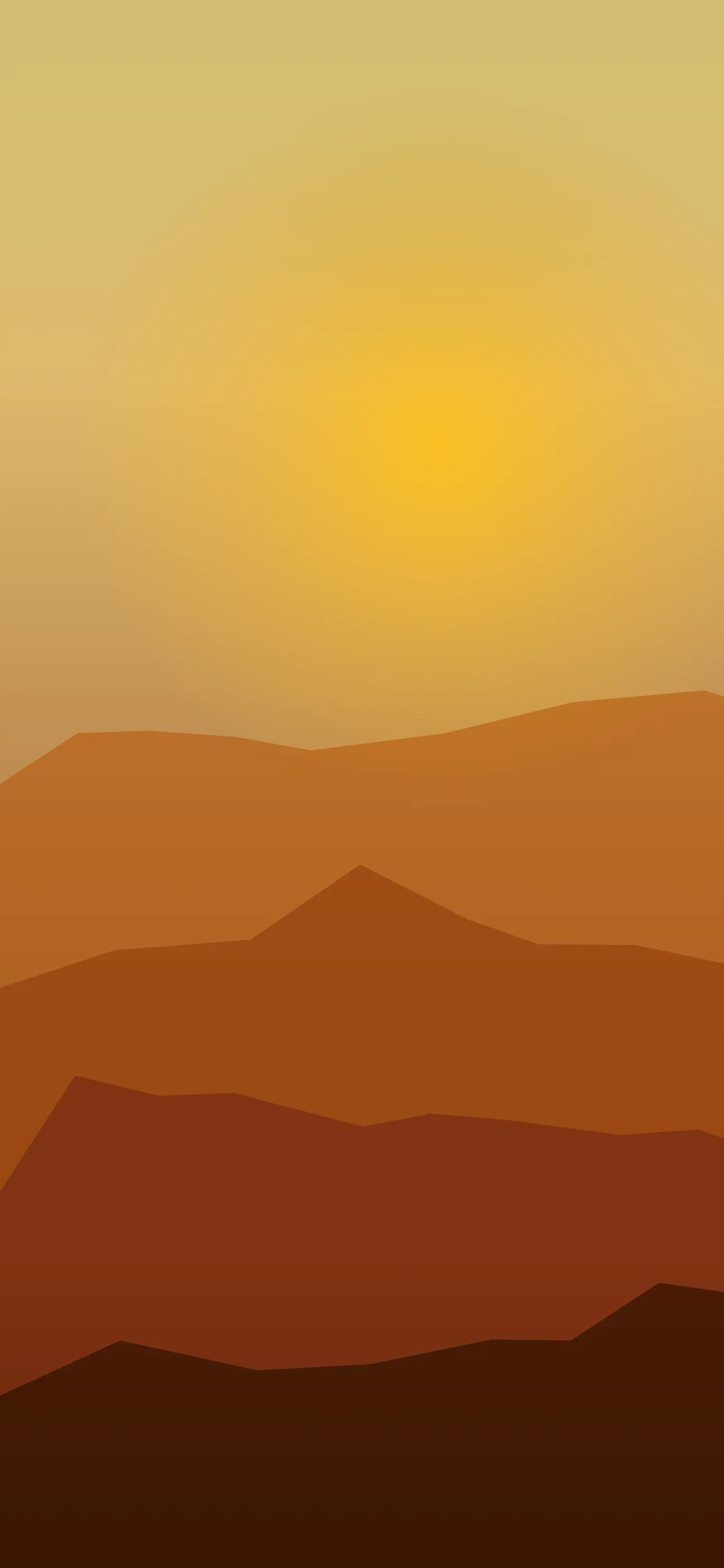
These combine into a few recognizable directions: desert boho (sand, cacti, terracotta, sun arches) leans hardest into the Southwestern-adjacent palette; earthy minimal boho (a single arch or pampas sprig on a cream ground) is the cleanest and easiest to keep legible; pattern boho (woven and mandala-style patterns in muted earth tones) is the busiest and closest to the 1960s original; and moody boho (deeper rust, charcoal, dried florals) is the darkest take, and the only one that suits an OLED screen’s battery-saving true blacks.
Getting the Composition Right
Boho’s palette is mid-toned and warm by nature, which usually gives iOS’s auto-adjusting clock text enough contrast without extra work — this is one of the more forgiving aesthetics on this list for that reason. The real composition task is where to put the texture: let busy elements like pampas grass, woven patterns, or dried florals sit in the lower frame, and keep the upper-middle — where the clock and Dynamic Island live — calmer. An arch shape framing the clock from the sides is a particularly good trick here, since it reads as intentional composition rather than empty space.
Texture is also boho’s biggest resolution risk. The whole appeal is in fine material detail — jute weave, plaster grain, woven pattern — and that detail is exactly what disappears first when a small image gets upscaled to fill a 6.7-inch screen; a flattened, blurry version of a woven pattern just reads as a blur, not as “boho.” Use a clean, full-resolution source at 1290×2796 (current Pro Max) rather than a stretched thumbnail, and watch for banding in smooth terracotta-to-cream gradients, which mottle easily when the source file is overcompressed.
Boho is unusually well suited to Depth Effect, iOS’s layered lock-screen look, precisely because it’s full of clear, nameable objects rather than abstract texture alone — a pampas sprig, a cactus, a hanging macramé piece, or a single arch shape in the lower frame all give the system something concrete to isolate and lift in front of the clock. A flat earthy wash with no distinct subject won’t trigger it. And because most boho is bright and sun-faded rather than dark, it won’t benefit from OLED’s true-black battery saving the way a dark academia or gothic wallpaper would — the moody boho variant above, with deep rust and charcoal on a near-black ground, is the one exception that renders cleanly on the OLED panels in every iPhone 14 Pro and later.
Widgets are the last practical detail: tinted widgets in terracotta, clay, or sage keep the earthy palette cohesive, while clear widgets let the underlying woven texture show through. Because boho already brings texture and warmth on its own, a cleaner Home Screen with fewer high-saturation widgets tends to look more deliberate than one piling on more pattern.
Making One
In Wallpaper Hub, boho’s earthy end overlaps with both the nature collection and the warmer side of abstract, framed for iPhone rather than cropped from a desktop interior-design photo. For something specific, the AI generator does well with prompts that name both the motif and the quiet zone needed for the clock — “earthy boho arch in terracotta and cream, woven texture, calm space at top” for the minimal direction, or “desert boho with pampas grass in the lower frame, sun-faded warm tones” for the fuller look. Use the editor afterward to deepen the clock zone or shift a palette warmer to match your icons; keeping a light sand version for daytime and a moody rust one for evening is a natural pair if you like switching by time of day.
FAQ
Does “boho” still mean the same thing it did in the 1960s? No — it kept the fringe, macramé, and earthy palette from the 1960s counterculture, but 2010s “boho chic” (Coachella fashion, Free People) stripped out the original political and countercultural meaning, turning it into a purchasable aesthetic rather than a lifestyle stance.
What’s the real difference between boho and cottagecore? Boho is globally eclectic and layers multiple cultural motifs (macramé, Moroccan-adjacent arches, desert plants) for a well-traveled mood; cottagecore is quieter and specifically pastoral, built around one calm European-countryside scene rather than an eclectic mix.
Is boho good for Depth Effect? Yes, more than most aesthetics on this list — it’s full of nameable objects (pampas grass, a cactus, an arch) that give iOS a clear subject to isolate. A flat earthy wash without one of these won’t trigger it.
Can a boho wallpaper work well on OLED? Only the moody, dark variant — deep rust and charcoal tones on a near-black ground. Most boho is bright and sun-faded, which doesn’t benefit from OLED’s true-black power saving.
Wallpapers from Wallpaper Hub
Full gallery