Best Beige Wallpapers for iPhone
A guide to beige iPhone wallpapers covering warm and cool neutrals, clock legibility, widget contrast, Depth Effect, and keeping tones from washing out.
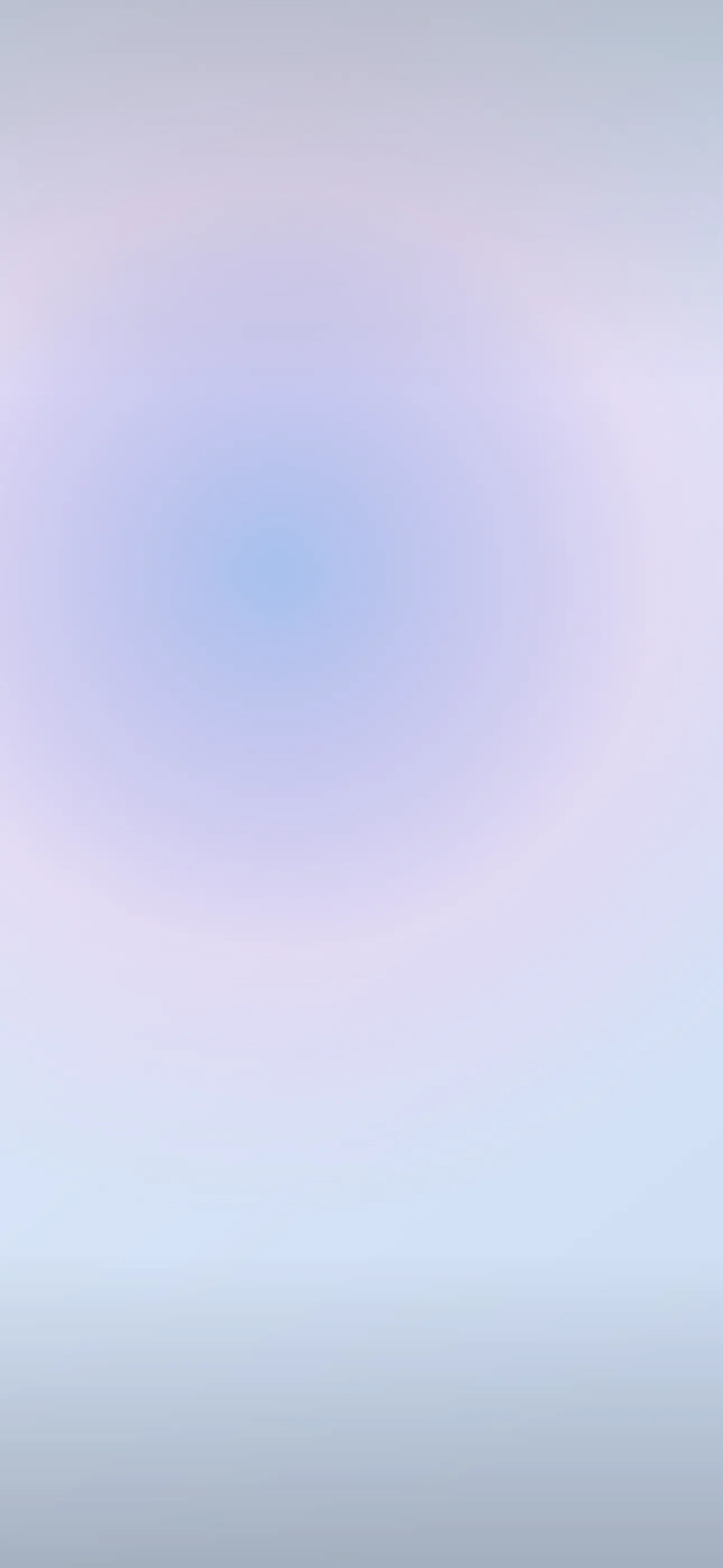
Beige is the quiet backbone of the whole neutral-aesthetic look. It reads calm, expensive, and timeless, and it pairs with almost any app icon or widget you throw at it. But beige is also where a lot of lock screens go wrong: pick a tone that’s too pale and the clock fades, pick one that’s too flat and the screen looks like a blank wall. This guide covers how to choose a beige that stays warm, legible, and genuinely nice to look at all day.
What counts as beige
Beige isn’t one color so much as a family of soft, low-saturation tones sitting between cream and light brown. The useful distinction is temperature:
- Warm beige — cream, sand, oat, and “latte” tones with a yellow or pink undertone. These feel cozy and organic.
- Cool beige — greige (grey-beige), taupe, and stone, which lean slightly grey or mushroom. These feel modern and architectural.
- Deep beige — mocha, camel, and clay, which add enough depth to anchor a screen on their own.
Most people gravitate to warm beige for an everyday lock screen because it flatters skin tones in any selfies stored nearby and complements wood, linen, and ceramic textures.
Palettes and motifs that work
Pure flat beige can feel sterile, so the most popular beige wallpapers add gentle structure:
- Paper and linen texture — a barely-there grain that catches light without adding clutter.
- Tonal gradients — oat fading to sand, or cream into taupe, top to bottom.
- Minimal line art — a single thin botanical, arch, or abstract curve in a slightly deeper tone.
- Soft shadows — a diffused shadow falling across the frame, like sunlight through a curtain.
This overlaps heavily with the minimalist look, so if you like restraint, browse there too.
The legibility problem with neutrals
Beige’s biggest risk is the same as pale pastels: low contrast. iOS auto-adjusts the clock color, but on a uniformly light beige even dark text can look weak. The fixes:
- Choose a wallpaper that runs slightly deeper in the upper-middle, where the clock and Dynamic Island sit, so white or dark numerals have something to rest against.
- Keep the truly pale tones near the bottom of the frame instead of behind the clock.
- Test the result in bright sun and a dark room before committing.
The space behind and around the Dynamic Island matters too. A clean, even tone there looks intentional, while a busy texture right at the top can clash with the pill.
Widgets and home screen pairing
Beige is forgiving with widgets, which is part of its appeal. Tinted widgets in a tone slightly darker than the background — a clay tint on an oat ground, for example — keep everything cohesive. If you run a lot of full-color app widgets, a beige base calms the overall look so the screen doesn’t feel loud. A matching beige home screen with muted icon colors completes the set.
Resolution and avoiding banding
Smooth beige gradients are prone to visible color steps (banding) if the source image is small or upscaled. On a current Pro Max panel at 1290x2796, that banding is obvious. Always start from a clean, full-resolution image rather than a saved thumbnail, and avoid heavy compression, which mottles flat neutral fields.
Depth Effect and beige
A flat beige wash won’t trigger Depth Effect because there’s no subject to isolate. But a beige composition with one clear foreground element — a single dried flower, a small vase, a piece of folded fabric in the lower frame — can layer behind the clock for that subtle 3D feel. If you want that, choose a photographic or illustrated beige with a defined object rather than an all-over gradient.
OLED and beige
Beige is a bright, all-on look, so don’t expect the battery savings that come with true-black OLED wallpapers. That’s fine — beige is about mood, not efficiency. If you want a darker evening companion, a deep mocha or taupe reads softer at night while staying in the same neutral family. Every iPhone 14 Pro and later uses an OLED panel, so deeper tones render with clean, even color.
How to set or AI-generate a beige wallpaper
In Wallpaper Hub you can browse beige textures, gradients, and minimal compositions already framed for iPhone, or build your own:
- Try the AI generator with prompts like “warm oat beige linen texture, slightly deeper at top, soft natural light” or “greige tonal gradient, single thin botanical line, minimal.”
- Use the editor to deepen the clock zone or shift a cool beige warmer to match your icons.
- Keep one airy daytime beige and one deeper mocha for evening.
For setup help, see How to Set an Aesthetic Wallpaper, and for a broader neutral palette, the Best Minimalist Wallpapers guide pairs well.
FAQ
Why does my beige wallpaper make the clock hard to read? Beige is low-contrast, so a uniformly pale image gives the auto-adjusting clock little to work with. Pick a version that’s slightly deeper in the upper-middle where the clock sits.
Does beige work with Depth Effect? Only if there’s a clear foreground object to isolate. A flat wash or gradient won’t trigger it; a beige scene with a single defined element can.
Wallpapers from Wallpaper Hub
Full gallery